Watergate App
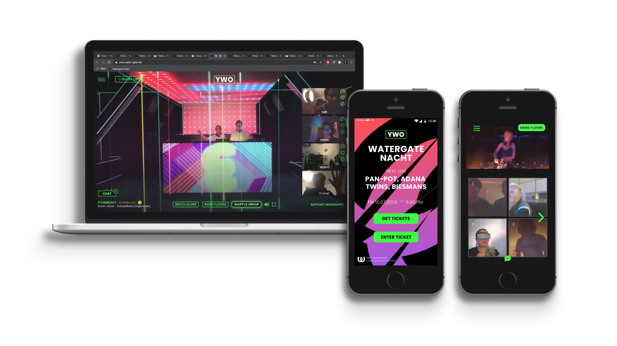
„No long queues, no high admission prices, but good music and a chat function: The Berlin club Watergate opened on Friday on the Augmented Reality platform „Yes, we’re open“ and is thus a pioneer in the scene.“

0.5.2020 – 07.2020
Brief / UI & UX For Mobile App
Agency / Ping Pong Labs GmbH
Client / Watergate
Role / UI & UX Designer
#UI #UX #sketch #prototyping #styleguide #testing #architecture
The coronavirus pandemic forced many cultural institutions to stop or reduce their activities to a minimum. Berlin-based music club Watergate reacted to this situation with an Augmented Reality platform that enabled a virtual club experience. This brand-new service was available on desktop and mobile devices (iOS). I created the UI & UX for the app.
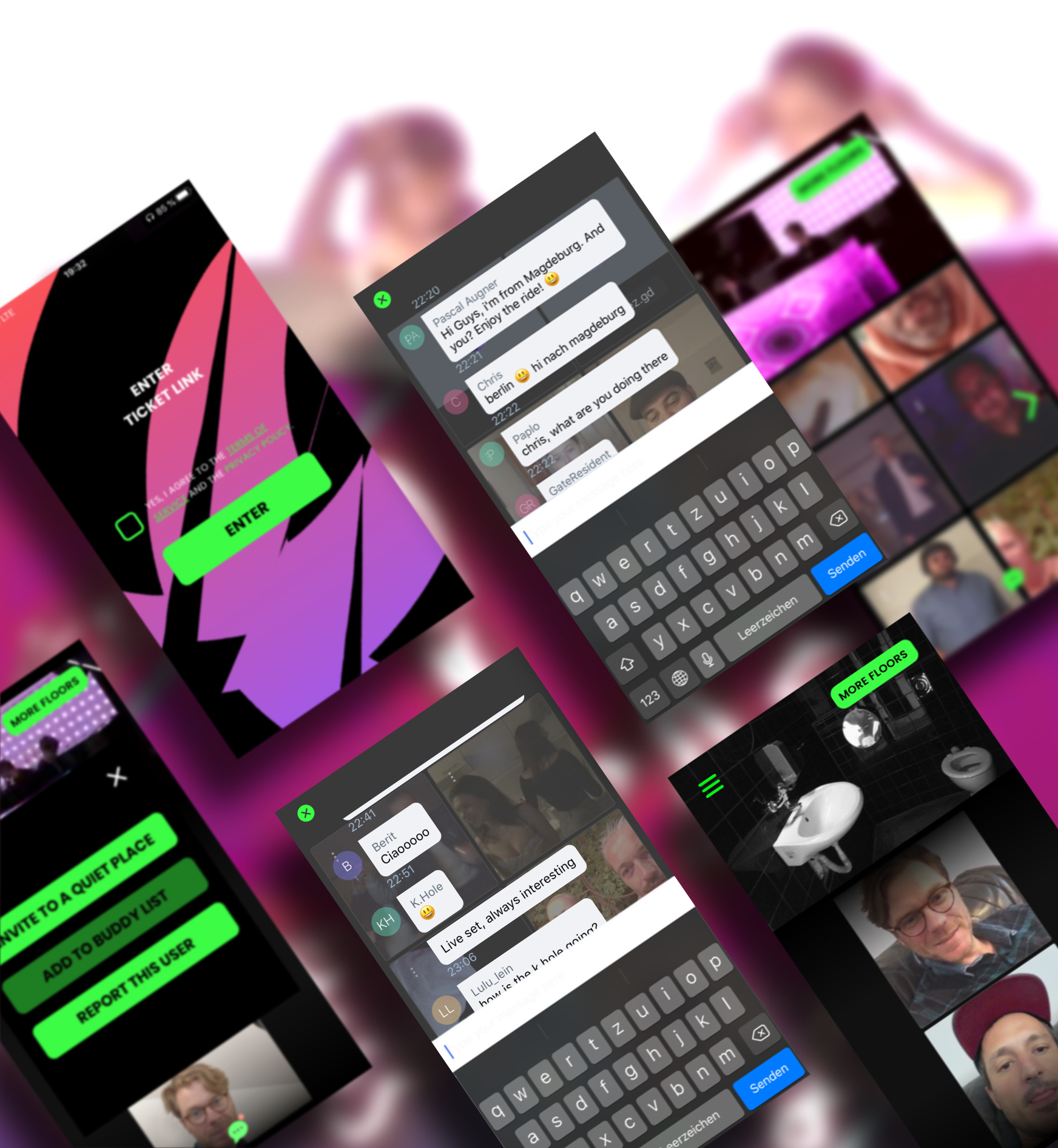
How It Works
On the website YWO (Yes, we‘ re open) you can buy a group or single ticket. You will then receive a URL ticket. This allows you to enter the club from a desktop computer or mobile device at the time of an event. In the club, you can listen to music on different floors or chat with guests in the chat room. You can go to the terrace to talk via video. And it is also possible to invite someone to a quiet place for a private chat. A group ticket is like a single ticket, except that you can party alone with friends.
Process
I was responsible for the UI and UX of the iOS app. After being briefed on general user requirements, technical specifications, guidelines, etc., I started planning the human-centered design process.
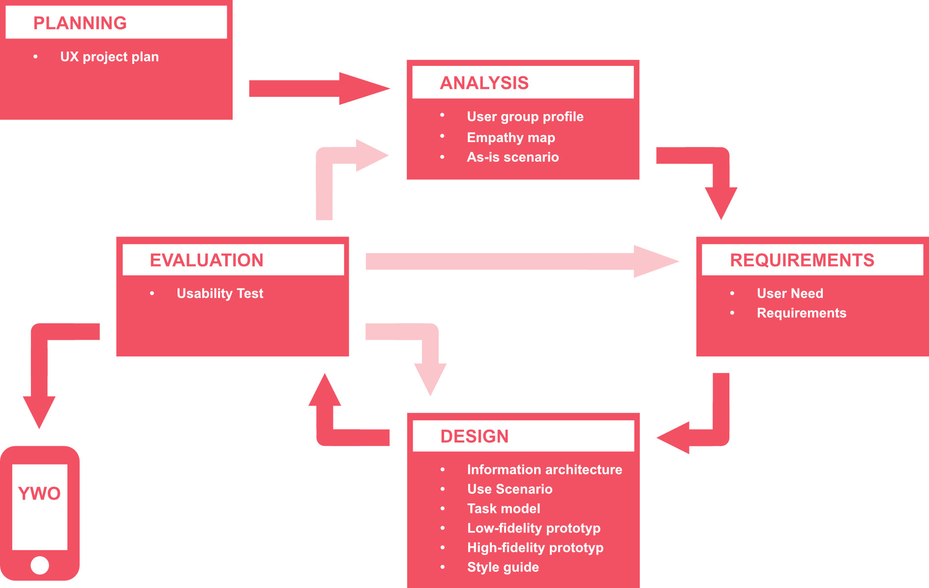
Planning
My UX project plan contained:
- Quality objectives in respect of user experience and usability.
- UX-Deliverables and related activities.
- Time and cost plan.
Analysis
The first step was to analyze and specify the context of use. I have supplemented the information available to me with findings from further research. Based on this, a user group profile, an empathy map and an as-is scenario were created.
User group profile
People in their younger or middle age. They live primarily in cities and like to go out to bars, clubs or concerts. Sociable and communicative, they love meeting new people. It’s natural for them to use cell phones to interact and communicate.
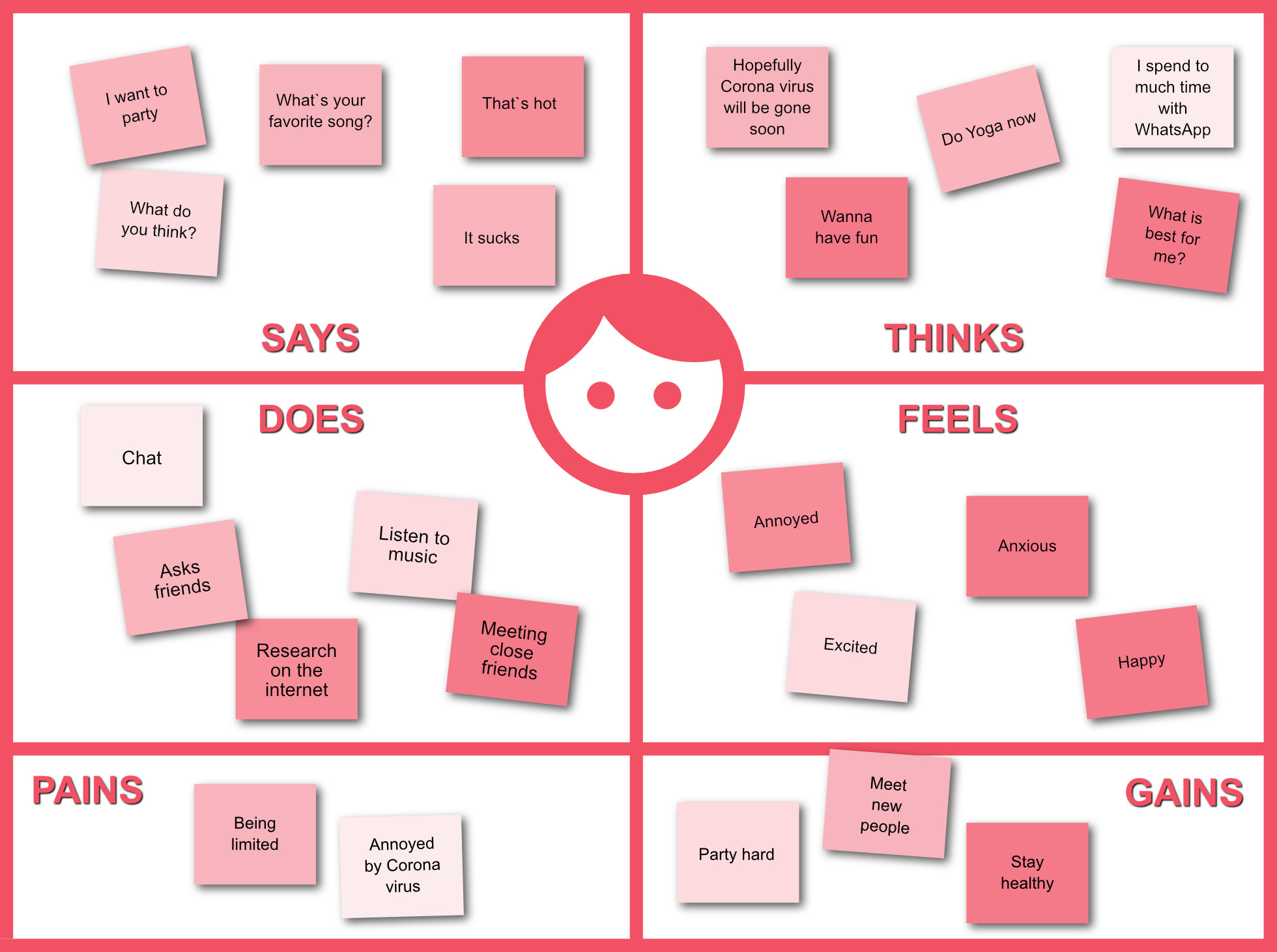
Empathy map
We put ourselves in the shoes of a prototypical YWO guest to capture its feelings, thoughts, and actions. Our goal was to become aware of the perspective of the club visitor.
As-is scenario
In addition, I described a realistic but fictitious user in his context of use, what he thinks and does. My description was verified and adapted by real people.
Max is a young architect from Berlin. He loves hanging out with his friends. On weekends, they usually go to a club to listen to cool DJs and meet new people. Because of the coronavirus pandemic, Max stays at home a lot now. He and his friends video conference regularly and sometimes have a beer in front of the screen – a substitute for the missing parties. Max is looking forward to going out again and having a party.
Requirements
The conditions that the app had to meet had to be verifiable in usability tests. For me, they were also useful as design guidelines to ensure that the app met user expectations.
I first identified what is necessary for users to achieve goals in their context of use (1). Based on this, I described what users need to be able to do with the YWO app (2). Then, I determined the level of usability to meet users‘ needs, i.e., the acceptance criteria (3). Last but not least, I defined the rules that users must follow when performing tasks (4).
- User need: A guest (user) of a virtual club (context of use), who not only wants to listen to music but also wants to meet people, needs interaction possibilities (prerequisite) in order to get in touch with others (goal).
- Qualitative user requirement: Users must be able to interact with other users in a low-threshold, face-to-face manner.
- Quantitative user requirement: After using the app during an event, 80% of 20 users must answer „I agree“ to the statement „It was easy to get to know people.“ (User experience).
- Organizational requirement: Before entering the club, users must confirm that they have read the Terms and Conditions.
Design
Information architecture
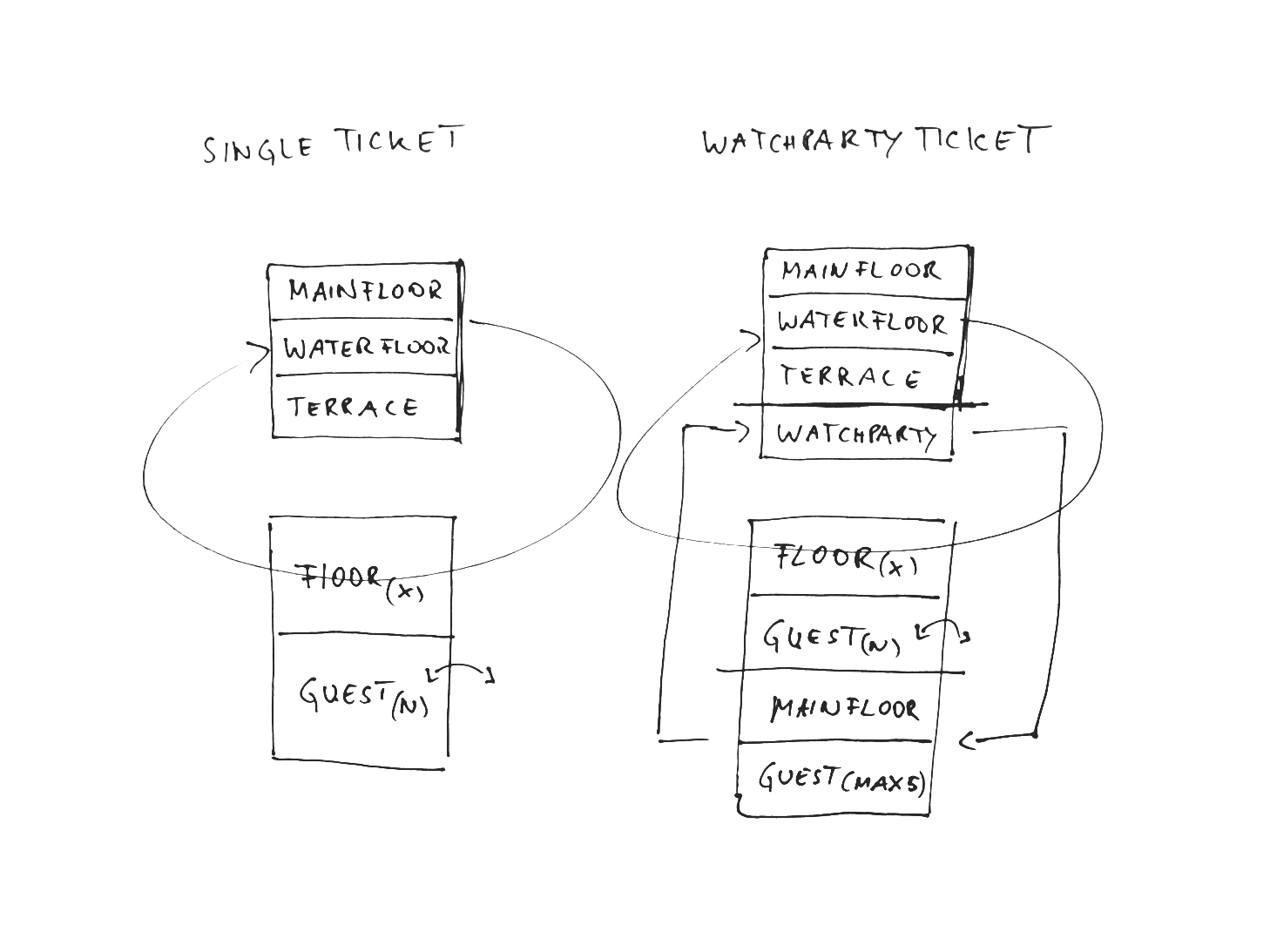
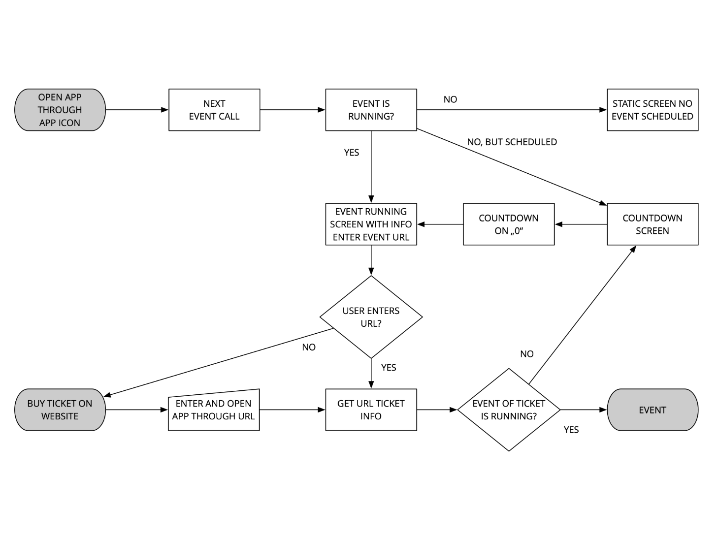
As a team, we structured the available information and visualized the path the user had to take through the app. At a very early stage of the process, we wanted to clarify causalities, uncover logic errors, and simplify the process.
Use scenario
Using the use scenarios, I began to describe how tasks can be done with the envisioned app.
- A guest enters the virtual club and looks at the music floors. Then the guest goes to the terrace and talks to other guests via video. After a small talk, he invites one person to a quiet place.
Task model
For each task, I listed the subtasks that the user must complete to achieve his goal. This description should help me later to design the right solution.
Setting
- Interactive system: YWO app.
- User: Person visiting the Watergate.
- Task: Invite a person to a quiet place.
- Precondition: User has decided to meet other people.
- Goal: Get to know someone in person.
Subtasks
- Check out Watergate club.
- Go to the terrace.
- Choose a person you want to talk to in private.
- Click on the menu in the picture of the person.
- Click the button to invite to a quiet place.
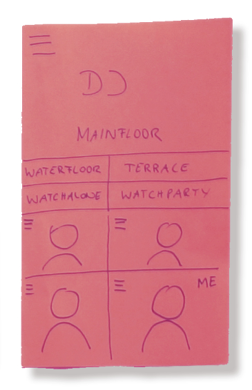
Low fidelity prototype
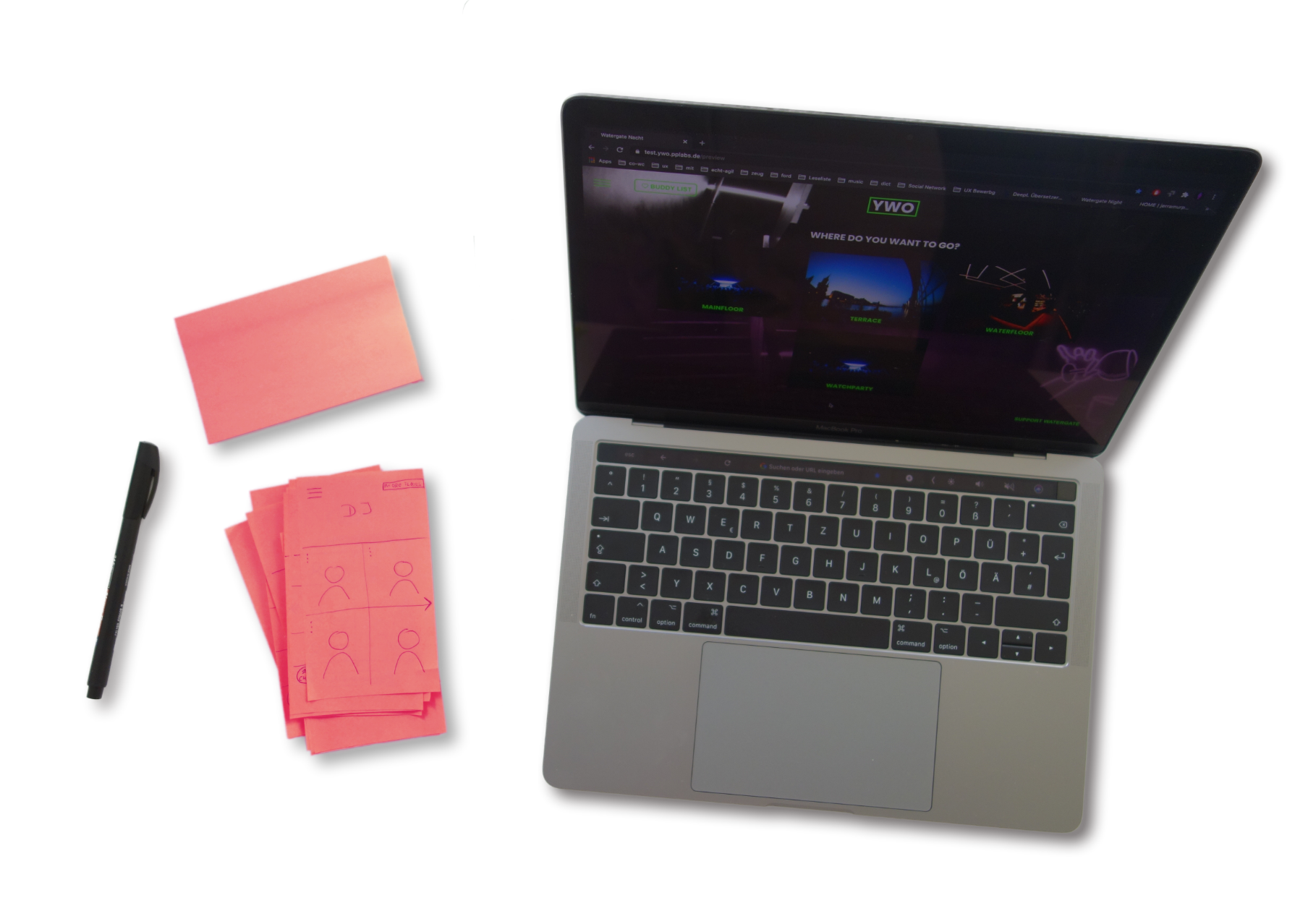
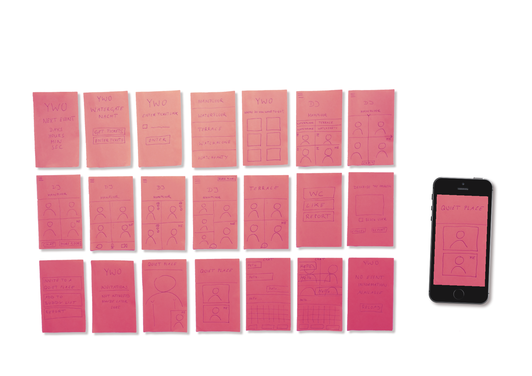
After approaching the challenge with sketches, I began building a lo-fi interactive prototype using the Marvel app. This prototype was limited in functionality, but included basic information and controls. It was intended to illustrate the concept, give a first impression of the design, stimulate constructive discussion, and most importantly, enable early usability testing. At this stage, feedback could be integrated quickly and easily.
Guerilla Tests
Guerrilla testing is a great way to get quick feedback. I used this testing strategy in all phases of the project.
- Hypothesis to be tested: I believe that users want to be able to see and select all floors at any time. I will be right if 80% of the users surveyed rate this positively.
- Result: Test subjects do not need to see all „floors“ all the time or be able to select one.
- Solution: The buttons have been removed.
- New hypothesis: I believe that users want to swipe between floors – just as they do between guests. I will be right if 80% of the users surveyed rate this positively.
High fidelity prototype
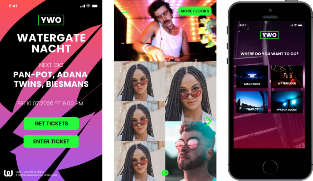
Next, I set to work on a detailed and feature-rich prototype. I used the iOS design kit and followed the style guide of the YWO desktop version to ensure consistency between the desktop and mobile version. I also considered general dialog principles (DIN EN ISO 9241-110), specific usability principles (Jakob Nielsen’s 10 Usability Heuristics for User Interface Design) and application specific principles (iOS Human Interface Guidelines).
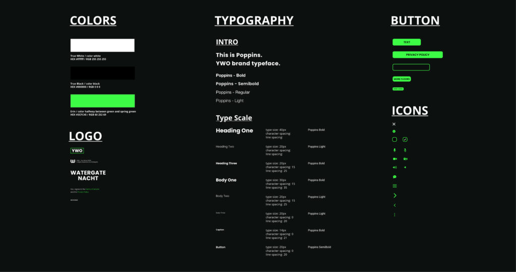
Style guide
Style guide for the YWO iOS app.
Evaluation
With the HiFi prototype, I also wanted to do a more in-depth usability evaluation. This time, representative users were to complete very specific tasks with the YWO app. The goal was to identify usability issues and measure effectiveness, efficiency and satisfaction.
Study design
My test plan included information on usability results, test subjects, approximate duration of each session, frequency, and incentive. In a test script I described the steps in the test: briefing, pre-session interview, test tasks, and post-session interview.
The study was designed along questions/hypotheses and tasks/scenarios.
- Question: Can the user invite a guest to a quiet place?
- Hypothesis: User easily can invite other guests.
- Testable: Users understand information/controls and use them correctly.
- Disprovable: User cannot find relevant symbols.
- Task: Go to the terrace and invite a guest to a quiet place.
- Scenario: You want to check out the people in the club. You visit the floors and finally go to the terrace. There you meet another club-goer (in the test: me). Invite this person to a quiet place.
Recruitment
I recruited five test persons with matching characteristics and contexts of use – according to Jakob Nielsen, 5 people already find 85% of usability problems. They were all digital-affine, clubbers, between 20 and 40 years old. The test took place in the user’s natural environment and lasted about an hour. One exclusion criterion: person is not a clubber.
Session
My welcome was followed by a briefing on the purpose and process of the test, the participant’s contribution and some formalities. Then there was a pre-session interview. In this warm-up phase, participants were asked about their background, their experiences as clubbers and with similar apps. Next came the task part, that is, the question part with scenarios or general and specific tasks. Finally, I conducted a post-session interview to get an overall impression and answer open questions.
Report
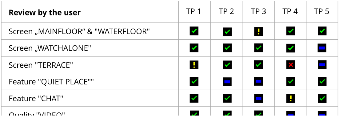
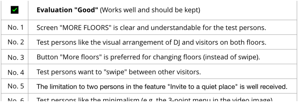
I made a presentation and report on my findings. It included an executive summary, the test script, the main results including recommendations, and screenshots to complement the descriptions.
Usability findings
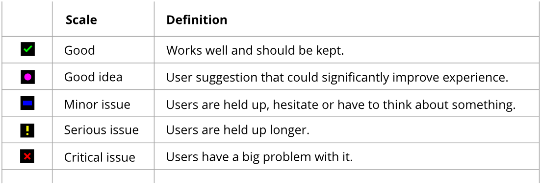
Using my criteria, I evaluated from the user’s perspective. I listed usability problems and positive usability results.
- Usability problem: Immediate display of own image when entering a floor.
- Positive usability finding: Menu on the image of the people (may remain).
Recommendations
Last but not least, I have listed recommendations, both mine and those of the test persons.
- My recommendation: „More Floors“ button to display floor overview – swiping function is hardly used.
- Good idea from test person: Personal account to collect and share events or music tracks.
Summing up
Challenge
- The navigation system: the YWO app should provide a good experience when the club visitor would move between floors and guests.
Learning
- Creation of an exciting User Interface.
__
I want to work with you.