Meet In Town
2018 – 2019
Brief / Build A Meeting App
Role / Experience Designer
#strategy #UX #research #testing #survey #interview #agile #lean #designthinking
The Meet In Town app helps you find best meeting place for everyone. Quick and easy, it suggests attractive spots where you and your friends can reach at the same time. Three friends and I developed this app together.
Birth of Meet In Town
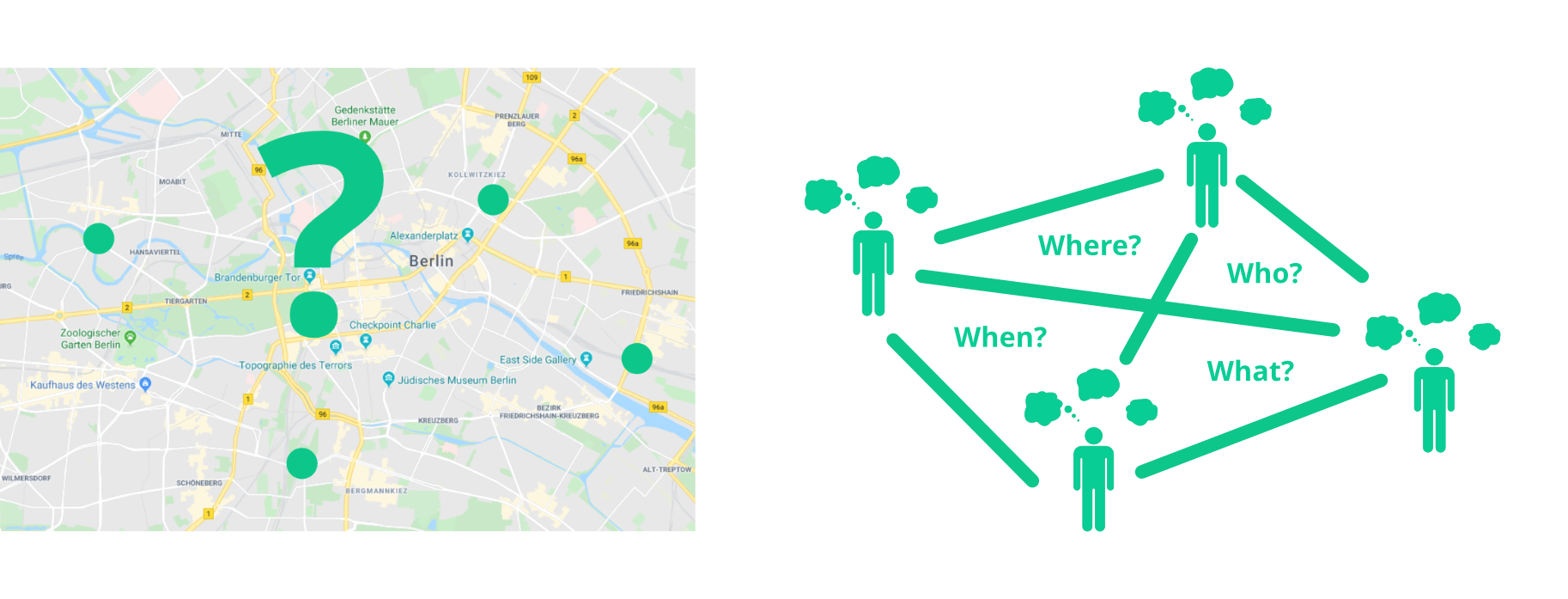
We love to hang out together, but it is not always easy to meet. Time is short, distance is too far, and meeting points aren’t charming at all. Besides, there is an endless ping-pong talk. Too much hassle. We needed to find a solution. Also because others seemed to have similar problems.
Cross-functional team
We were a team of four with different experiences: app development, web development, design, and project development / experience design (me). For us, only virtual collaboration was an option. However, regular meet-ups in coworking spaces were a must. During team building, we reminded ourselves to stay open to change, learn from failure, be optimistic, focus on creativity, and most of all, have fun!
Process
The question was, how do we tackle this challenge? I was responsible for project/product development in general and user experience in particular. My initial focus was on our approach. To have a framework to start with, I described some guidelines and the basic procedure.
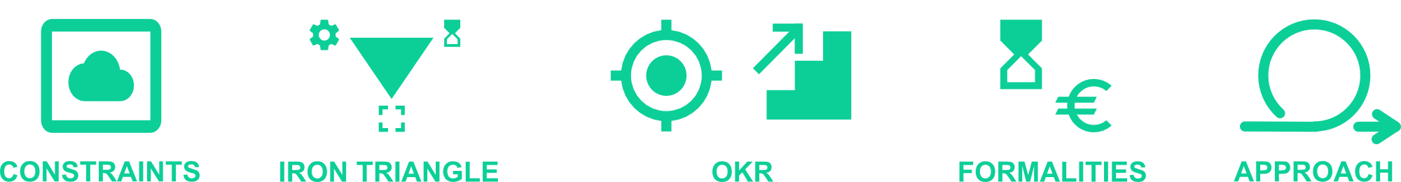
- Some thinking constraints to stay focused.
- Commitment to resources and time with a flexible scope.
- A set of objectives and key results.
- Time and cost plan.
- Design Thinking & Lean principles.
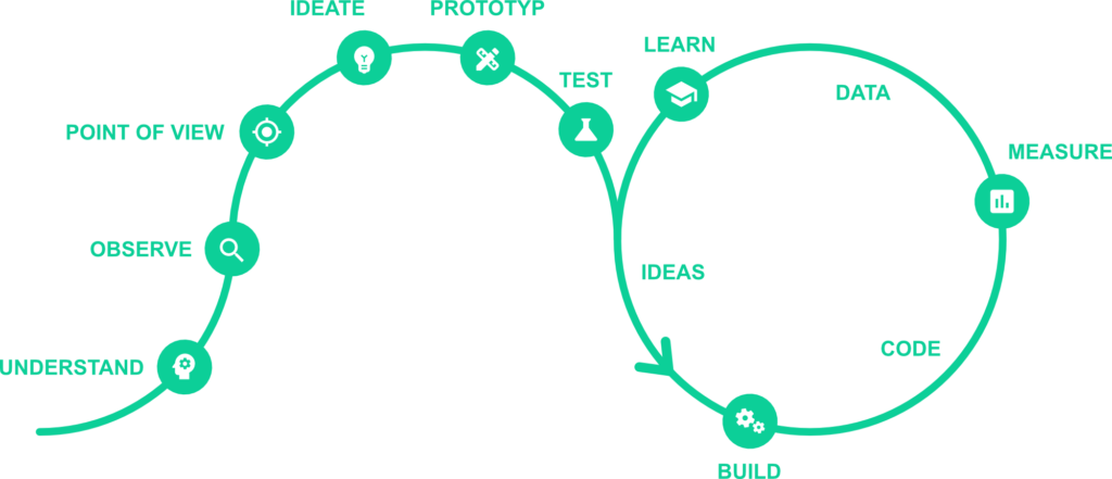
Design Thinking
It started with Design Thinking. Because it was clear that we were at the beginning of a solution-finding process and not at the point of realizing an existing idea.
Understand
So we began to share our experiences and develop a common sense of the topic. Meeting places seemed to be the problem: sometimes the distance to a place was too far or the time too short to go there, or there was no good meeting place. But what challenges and needs did others have?
Observe
Target Group
Who might have had trouble making (spontaneous) appointments in real life? Given our challenge, I looked at people with similar contexts of use and personal characteristics and created a user group profile.
Younger or middle-aged people who live in cities. They are sociable, like to go out, for example to bars or restaurants. In the first place, they use messaging apps to organize their schedules; I also included „extreme“ users (e.g., retirees), as this could lead to surprising results.
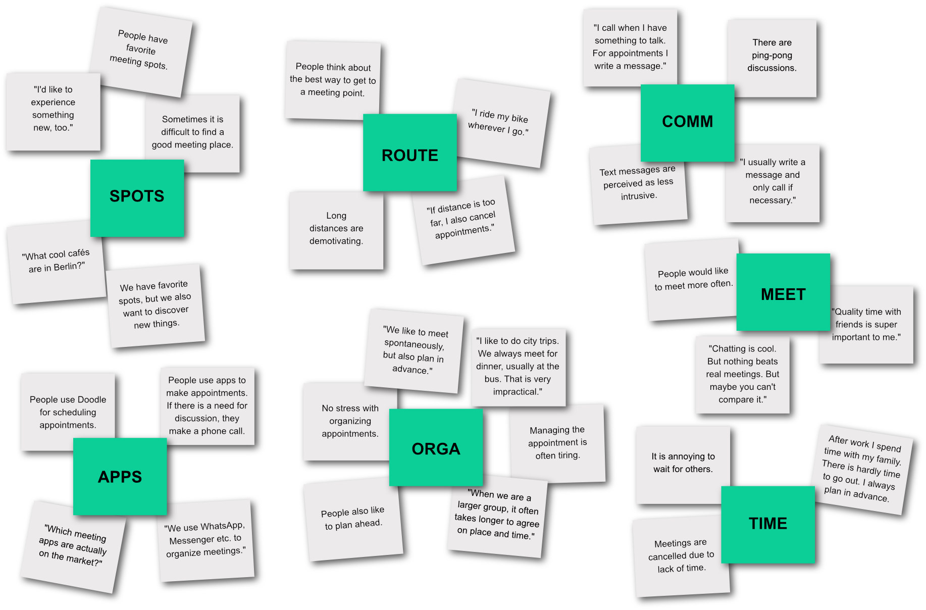
Observations
I conducted my field studies with my circle of friends and acquaintances. During the observation, I stayed in the background only occasionally asking questions. It was exciting to see how appointments were organized, what challenges were faced. There was much about how to deal with text messages.
Interviews
During recruitment, I prepared for the sessions by creating a checklist and updating interview principles. The interviews took place in diverse locations. I started with a briefing, continued with general questions, and dug deeper.
- General: How did you organize your last appointment?
- Deep going: Tell me how you will organize your appointments in 10 years and how this will affect your life.
Secondary Research
To ground our knowledge, I studied recreational behavior and media use, both in popular media and in academia. They formed a basis for discussion and were integrated into our reflection and development process.
Point of view
Time to translate research into findings. The goal was to give meaning to what I had learned, gain insights and identify key questions. It helped us define design options.
I categorized my results and gave names to these clusters. In this way, I got an overview and an idea of the topic. I then put it up for discussion.
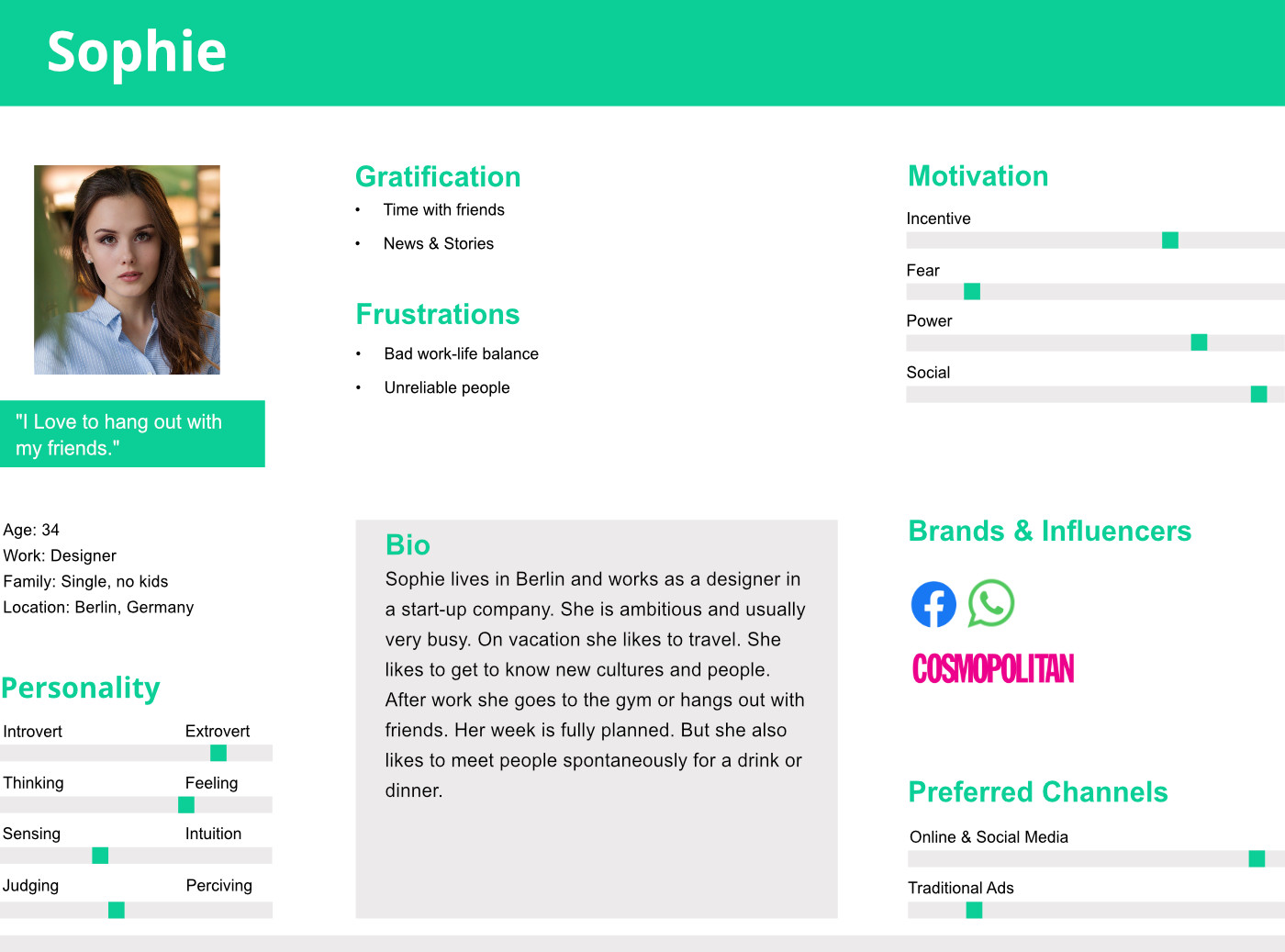
Persona Sophie
Based on my data, I created Persona Sophie, a fictitious but realistic user – we adapted it as a team. Sophie helped us understand our users better. By using this persona, we always had our users in mind and acted according to their needs.
Search For Meaning
Using the persona Sophie and the discovery collage, we began to turn relevant topics into insight statements.
- People would like to meet more often.
- Organizing meetings is frustrating.
- Long journey and waiting times are unpleasant.
- Mobile phones are used to organize meetings.
„How Might We“ Question
We framed our insights as question and focused on the following HMW question:
How can we help Sophie easily organize a meeting with her friends and meet them in an attractive place that everyone can reach at the same time?
This question served as the basis for further brainstorming
Ideate
We used various creativity techniques such as Figure Storming. The process was structured, the result sometimes crazy. Very important to us was the „Yes and“ approach, i.e. building on other ideas and not limiting oneself and others. After a dot voting, we agreed on an idea that seemed both promising and innovative:
An app that shows attractive places that are right in the middle of all the people who want to meet.
The project was given a name: Meet In Town.
Prototype
Breaking Down User Experience
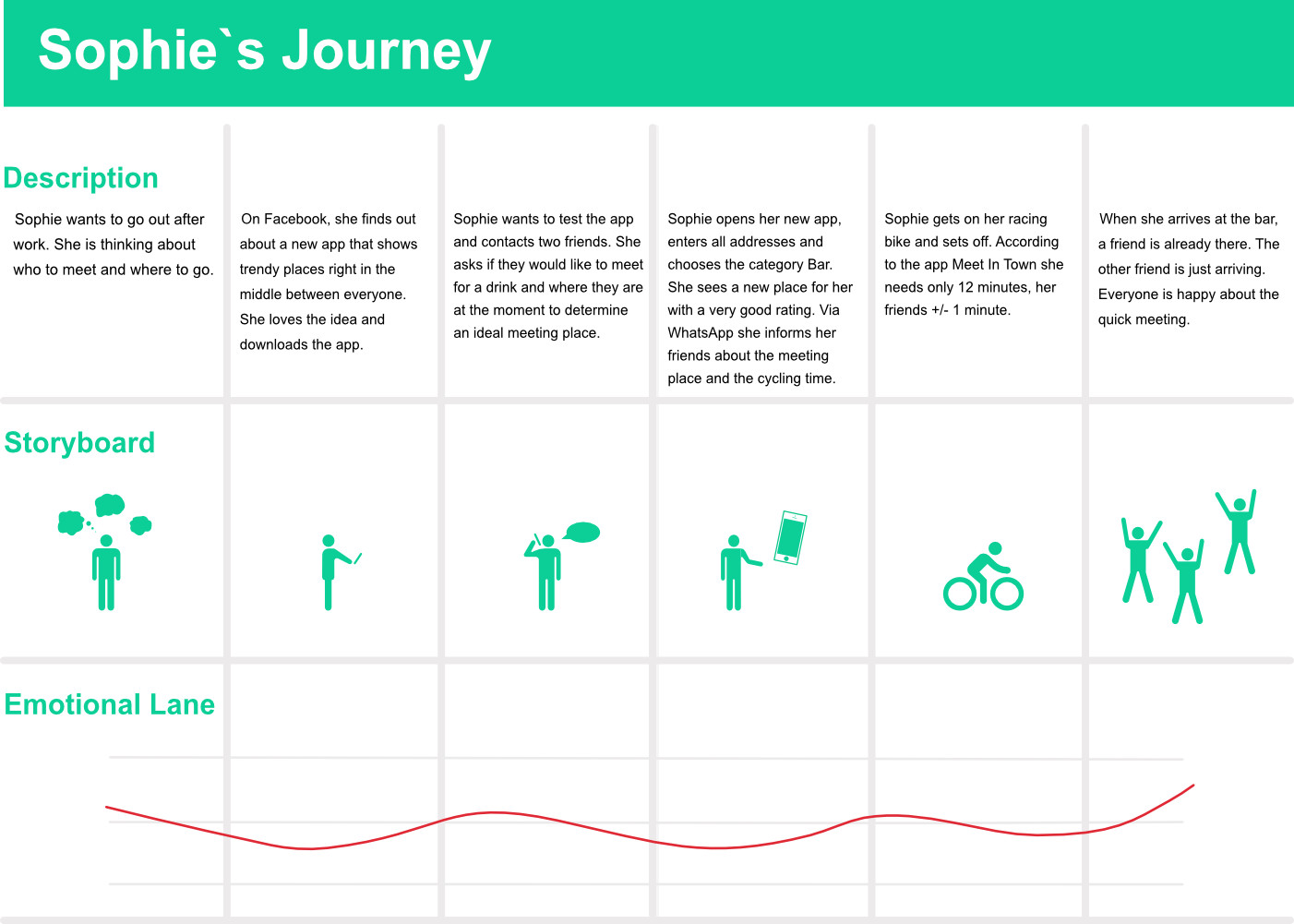
Time to build prototypes and gather feedback to improve our idea. First, I created an Experience Map. It gave an overview of the Touchpoints where users interact with our app or the Meet In Town project. And it broke down our idea into smaller components that were easier to test. I illustrated the user experience for our persona Sophie. This was a starting point for many questions and discussions.
- How do people hear about Meet In Town?
- Should people pay for the app?
- How does the appointment process work?
- How will people use the app?
- Which meeting points are displayed?
- How do people get to the meeting place?
Making Prototypes
Sophie`s Story
I told a story about our app idea from the future. Persona Sophie and her adventures were the focus. The goal was to understand the experiences you can have with our app Meet In Town.
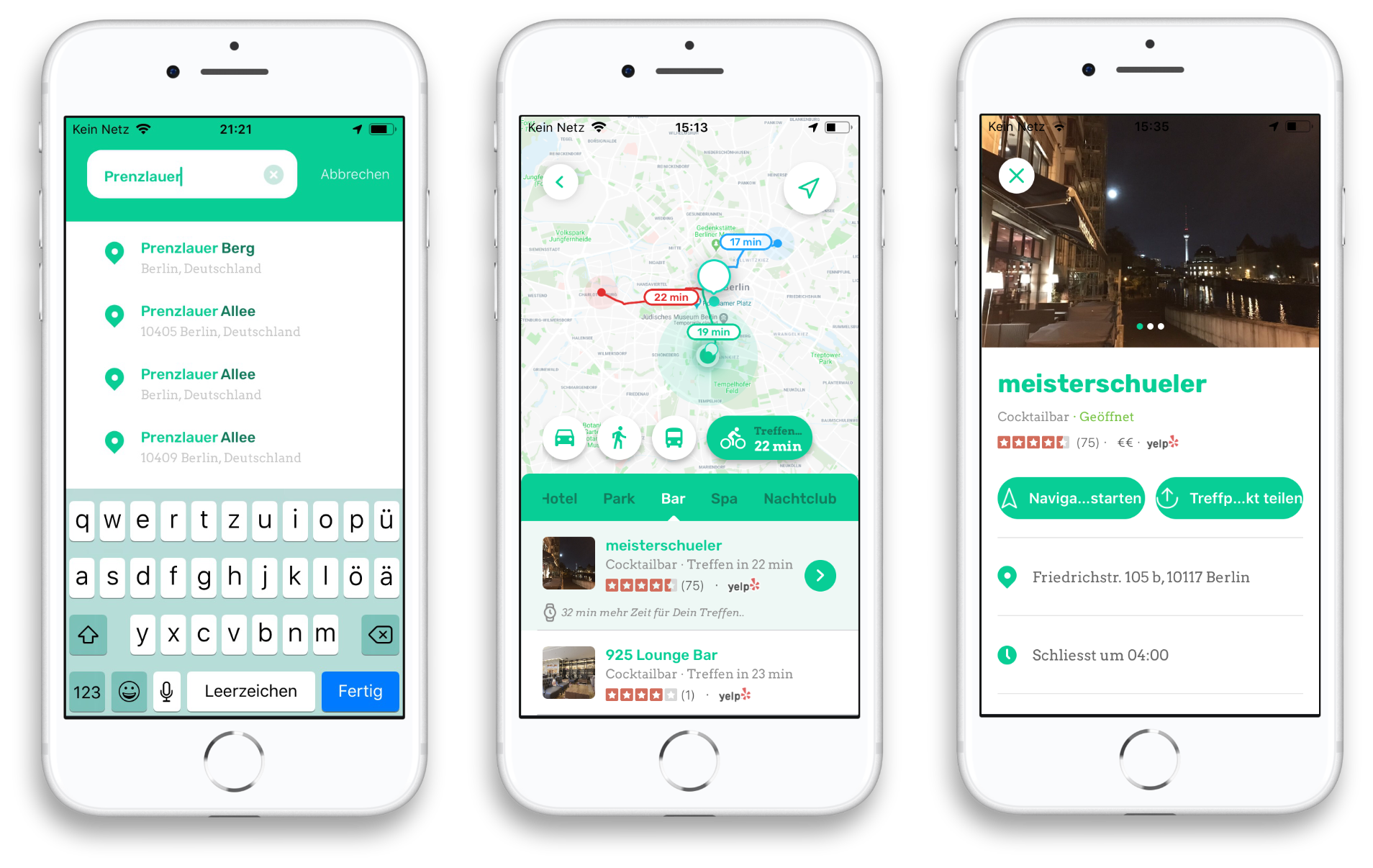
Sophie wants to meet friends for a drink after work. She knows that Ute is at home and Georg is out shopping. First she calls Georg. He’s at the Berlin TV tower and open for a spontaneous drink. Sophie then talks to Ute. Following the call, she opens her Meet In Town app. She enters her own address and those of the others into the app. After choosing a hip bar that’s right in the middle of them all, she shares the meeting place via WhatsApp. They all arrive at the bar at the same time and see each other much faster than expected.
App Prototype
After the decision for a meeting app was made, we started with the design and programming. Very soon there was a lo-fi prototype. And shortly after, a hi-fi prototype was available via Apple’s TestFlight program.
Benchmarking
This was a good time to analyze similar and successful products. Based on this, I formulated assumptions to maximize the use of the app. It included…
- more than two users,
- different means of transport,
- categories with attractive meeting points.
Test
From the very beginning, I did guerrilla testing, or more precisely, I asked friends, acquaintances and strangers about our app prototype. This way I received feedback quickly, for example on usability issues. The tests enabled us to make adjustments at an early stage and with little effort. We developed our vision step by step.
Build Measure Learn
No unnecessary documentation, iterative development and incremental improvement – our agile approach evolved into the build-measure-learn feedback loop of the lean process. We worked with hypotheses, developed our vision, and gathered feedback. With the learnings we gained, we moved to the next round, and so on.
Ideas
First, I defined what I wanted to test or needed to learn. I developed hypotheses that could be validated, such as:
- Assumption: Users consider how they want to get to a meeting point.
- Hypothesis: I believe that if users can choose between different means of transportation, they will choose the one that is most convenient for them.
- Measurement: This hypothesis is correct if I can observe that the options offered are used or positively evaluated.
- Research method: Usability test and surveys.
Build / Code
Time to create the smallest possible hypothesis testing product, with core features that should be both interesting and useful. With our Minimum Viable Product (MVP), we wanted to find out as much as possible about the product and its users with minimal effort.
Measure
I carried out tests, surveys and inspections.
Study design
My test plan included the purpose of the test (testing hypothesis and usability), number of participants (5 people), session duration (45 min), frequency (at each iteration) and cost estimate (coffee & cake per test). I also created a script for the test procedure.
Recruitement
I selected people with suitable characteristics according to various criteria, e.g. personal background, knowledge of the subject, attitudes and interests. One exclusion criterion was too much involvement in the project.
Sessions
- Briefing: I informed the participants about the session and their role and contribution.
- Pre-session: Brief warm up to learn more about the subjects‘ experiences with similar applications.
- Test part: Question part, for example:
- Task: Go to the meeting point.
- Scenario: You’ve been on the phone with a friend and want to meet for a drink – your friend is at the Brandenburg Gate right now. With the MIT app, you’ve found a fancy bar that’s right in the middle between the two of you. Share the information with your friend (in the test: my email).
- Post-session: Debriefing on the overall impression of the app (usability issues, etc.).
- Closing: Answering open questions.
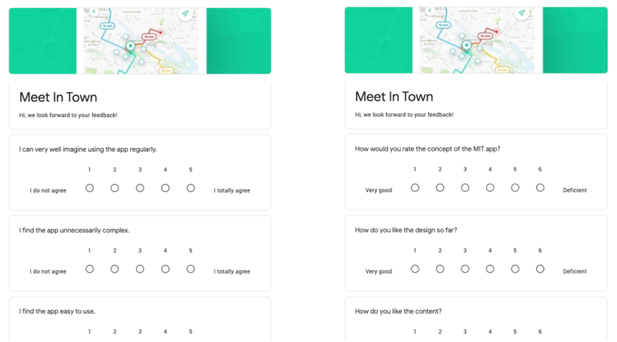
Online Surveys
I created online surveys using Google Forms to gain deeper insights. One was about user experience and hypotheses, the other was about usability.
Usability Inspections
I regularly conducted usability inspections to identify usability problems. In doing so, I followed Jakob Nielsen’s 10 Usability Heuristics for User Interface Design and/or the interaction principles described in DIN EN ISO 9241 110.
Data
After the measurements, I analyzed my qualitative and quantitative data collection, i.e., my tests, surveys, and inspections. I grouped, sorted, prioritized the data and presented my findings to the team. Reports included study design, hypothesis and usability evaluations, including illustrative screenshots.
Problems
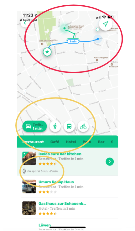
- The app shows the locations zoomed out too much (small problem).
Positive results
- Means of transport: The respondents rated the choice of means of transport positively. The online survey showed that more than 80% would include transportation choices in their planning.
- Time calculation: The MIT app calculates for each meeting point (in terms of distance) the time gained or lost for an appointment.
Learn
We integrated the user into the project from the beginning. Therefore, we never had to change direction (pivot), only make adjustments. Always a bit smarter than before, we took what we learned and went into the next cycle.
Summing Up
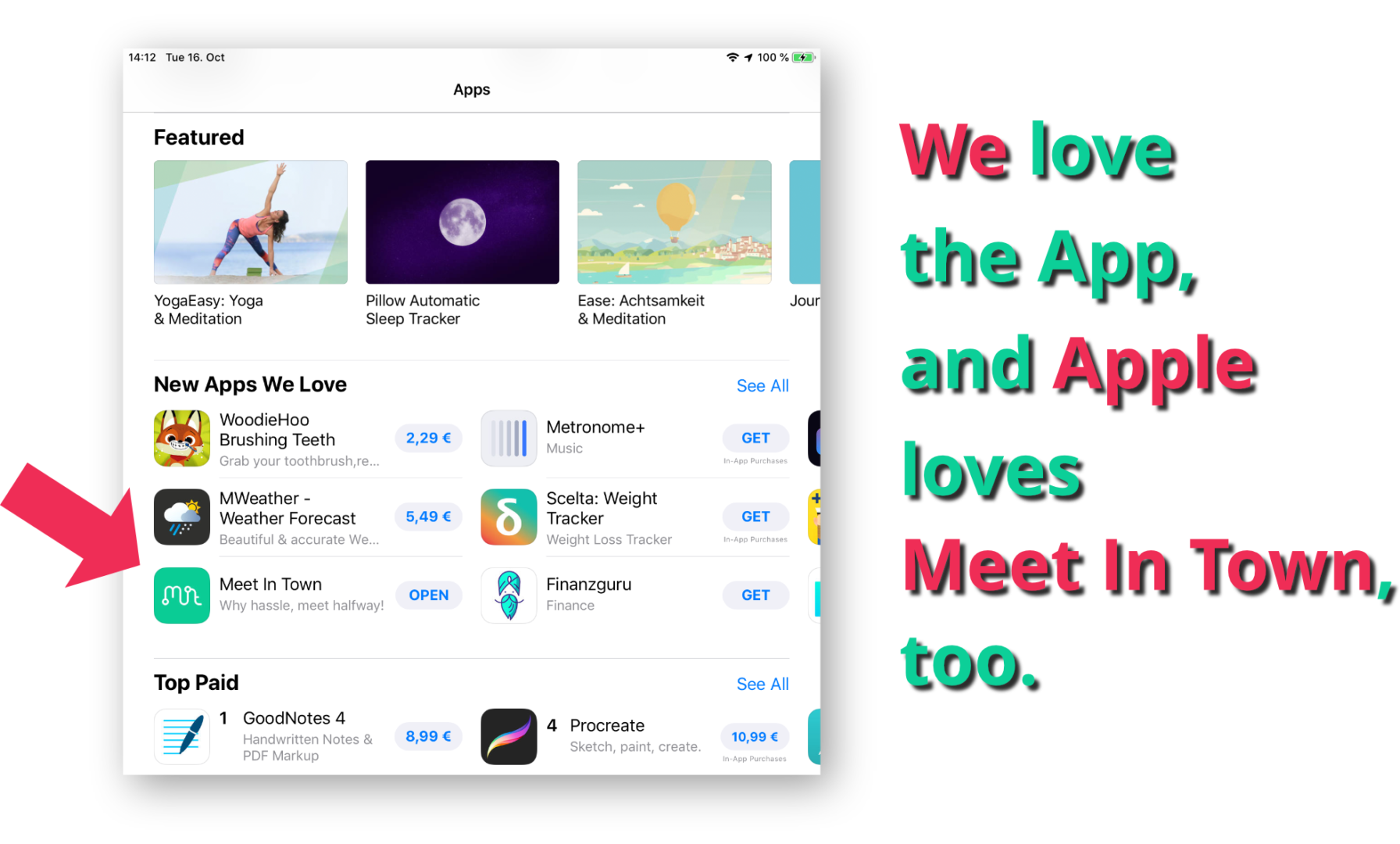
It started with an everyday problem. After a few months, there was a cool app featured by Apple in the „New Apps We Love“ category. Now we’re excited to help ourselves and others meet more often in town.
Challenge
- Professional development of a digital project with limited resources and time.
Learning
- Develop a digital product in a complex domain (Cynefin framework) using an agile/lean/UX approach.
__
I want to work with you.